Developing safety & regulatory signage can be an involved process… and we should know! When dealing with so many rules and regulations across multiple languages the challenge is multiplied. World-renowned design agency Pentagram worked with the City of New York to consolidate and rebrand the Department of Parks & Recreation and the signage systems that they use.
Originally published in CityLab by Kriston Capps
The Secrets to NYC Parks’ New Signs
Over the last five years, NYC Parks has very gradually introduced a new brand identity, including streamlined signs visible at most parks today.
Anticipating the questions of New York City park users is no small feat. The city’s Department of Parks and Recreations is the steward for some 29,000 acres of parkland across more than 5,000 different park properties, from spray showers and dog runs to beaches and stadiums. Knowing what service info any conceivable visitor might need—and often in languages other than English—resulted in a sprawling system of ad-hoc signage plastered over fences around New York’s parks.
Over the last five years, NYC Parks has very gradually introduced a new brand identity, including streamlined signs visible at most parks today. Paula Scher, a partner at Pentagram, developed the signage pro bono—restricting park signs to just two typefaces (Akkurat and Chronicle) and updating the familiar leaf logo. CityLab talked with Scher about how she brought the unruly signage system to heel and what she learned in the process.
CityLab: How did you get first get involved with NYC Parks?
Paula Scher: I was on the design commission under Mayor [Michael] Bloomberg. What I did as a design commissioner was I looked at everything that was made in New York City. During that period it was clear that the Parks Department really needed a signage program. Part of the issue was there wasn’t any modular kind of system, and they had to change their regulations all the time. If somebody would stub their toe in New York City, they could sue the city unless there was a sign that said, “Please wear shoes.” Of course, these things had to exist in all different types of languages. As a result, you’d go to a park, and there would be a plethora of signs all hung up individually, based on whatever problem they were solving in a given moment.
Tell me about your design strategy for approaching this job.
The Department of Parks and Recreations is huge in New York City. It’s acres and acres of parkland. There’s the local urban parks that everybody knows because they can be as small as a block. They’re all named differently. Bloomberg’s philosophy was that you shouldn’t live more than 10 minutes from a park. Some of them have private funding. I had worked on the High Line, which had a very extensive signage program, because it was all privately funded. The challenge [for NYC Parks] was how to develop a system for the parks where they could actually produce it and add onto it. It’s a modular configuration. It can be put together in a broad variety of ways. It’s quite extensive.
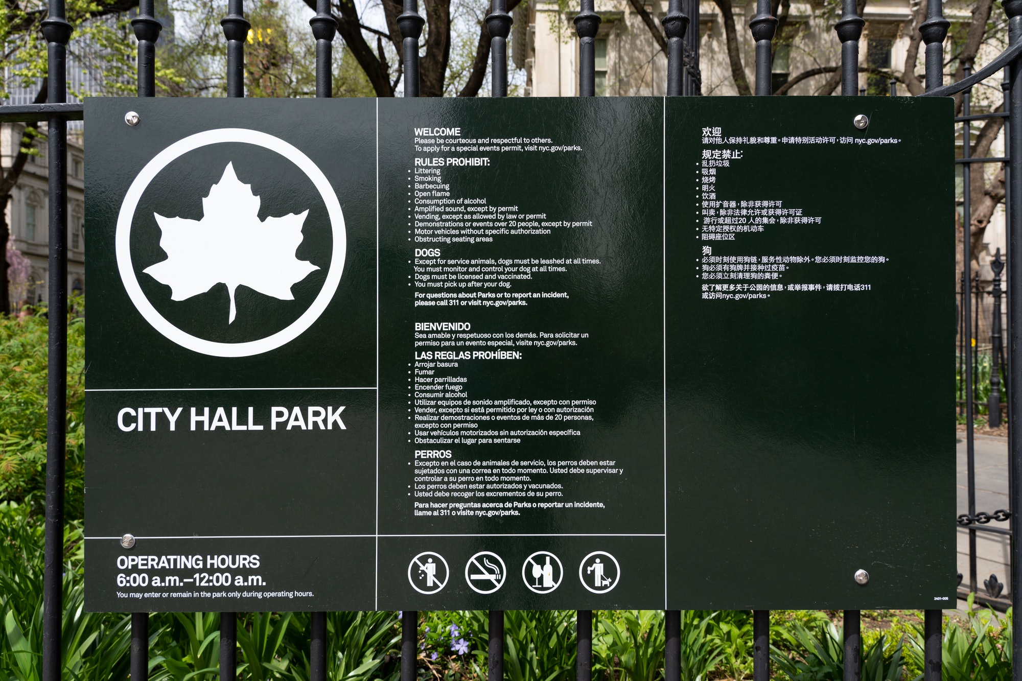
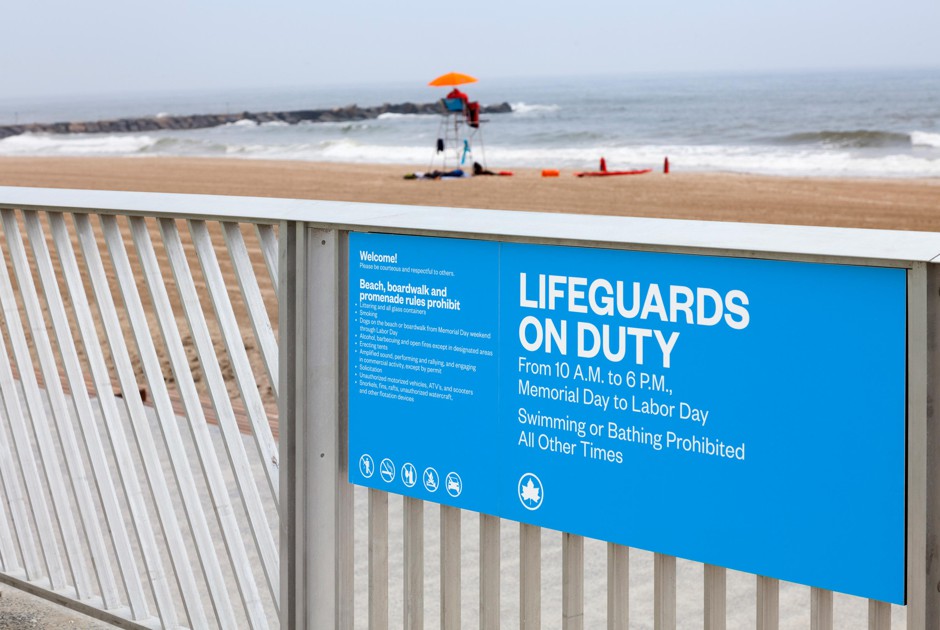
An example of the new signs for NYC Parks. (Pentagram)
It depends upon a given park. Each park has the title of the park, and that’s a piece. That’s put together with some guidelines for it, and sometimes the guidelines are in dual languages depending on the neighborhood, guidelines [for example] for when the park closes. Then there’s a bunch of don’t-do-this and don’t-do-that. That’s iterated in a series of circular warning signs. What you had to do is define the conditions as a square that can become modular. You might have warning signs that take up one square, or you might have warning signs that take up two squares or four squares.
How many signatures did it take to get this done?
I was working at a very unusual time. I was working directly with NYC Parks with two commissioners and some other people who worked inside the parks department in marketing and signage. It wasn’t that complicated. It was a complicated job to do, but it was a donation, so they made it very simple for me to accomplish. They gave me a lot of information, then they vetted the information, then I made revisions to it, then we looked at a series of conditions and responded to the conditions.
I think we finished the design in 2012, and there were all kinds of manual discussions for two years after that. And then they started slowly rolling them out. They rolled them out over a very long period of time. I saw one turn up in Madison Square Park. I live near Madison Square Park, and I saw it three months ago. It’s up! It was like that.
What’s the story behind the leaf?
The leaf was designed originally, I think, in 1934. People say, “Oh, you did Air Canada.” Nonsense. Air Canada did New York City. The maple leaf has existed as the parks department mark for years. Originally, when [NYC Parks] approached me, they wanted us to make it cooler.
We re-drew all the weights of everything so it seemed more streamlined. The original leaf was very heavy and clunky. We modernised it and we made the colour a cooler green. They used a deep typical park green. It just seemed very tired.
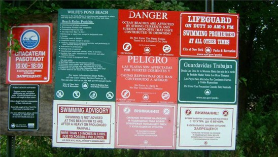
Signs for a beach under the old paradigm. (Pentagram)
What were the signs like that you replaced? How many different signs did you consolidate?
They was a system of different sign types. They had a green, elegant-in-style system for the name of the park. The park signs—they were up for a very long time—are the things that say the name of the park and show the leaf. They put that by itself at the gate of the park. Then, wherever they could, they just hang up signs as they needed them. The signs were all these warning signs. They would be positioned all over the place. Depending on what year they were done, they were in different colors. Sometimes you’d see them in seven colors together all at once. You’d see a blue sign, a red sign, an orange sign, a black sign, two green signs that didn’t match. They were all different sizes, stuck up on fences. It looked like a mess.
That was a big part of it—just trying to create order. We managed to create this grid structure. You could have different information on the signs, but [it] can all live together. They’re all one color. They’re all in the same typeface. Just natural, good old-fashioned modernistic order.
I’m sure there are people who bemoan modernity and miss the old elaborate park signs. They were embossed, they had routing and curvature to them. The names were depressed into the—I don’t think it was metal, it was some kind of plastic. They used to have the equipment for it right in the parks department. They were very proud of it.
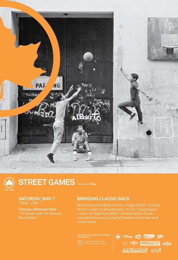
The brand identity extends beyond signs to other NYC Parks communications. (Pentagram)
How many things are prohibited in NYC Parks?
Probably a lot more than when I did it. It’s really quite amazing how many things are prohibited. It does come from lawsuits. They’re more reactive than proactive, because you don’t know what people are going to do. I was told that the bridges in New York City had fences at a certain height because somebody threw a frozen turkey off the side of the bridge and hit a boat going underneath. Things happen. This is a big city. I go to Paris and wonder how they have these nice low railings on bridges. They’re so much better behaved.